Caf ui
Year
2022
Deliverables
UX Design
UI Design
The Challenge
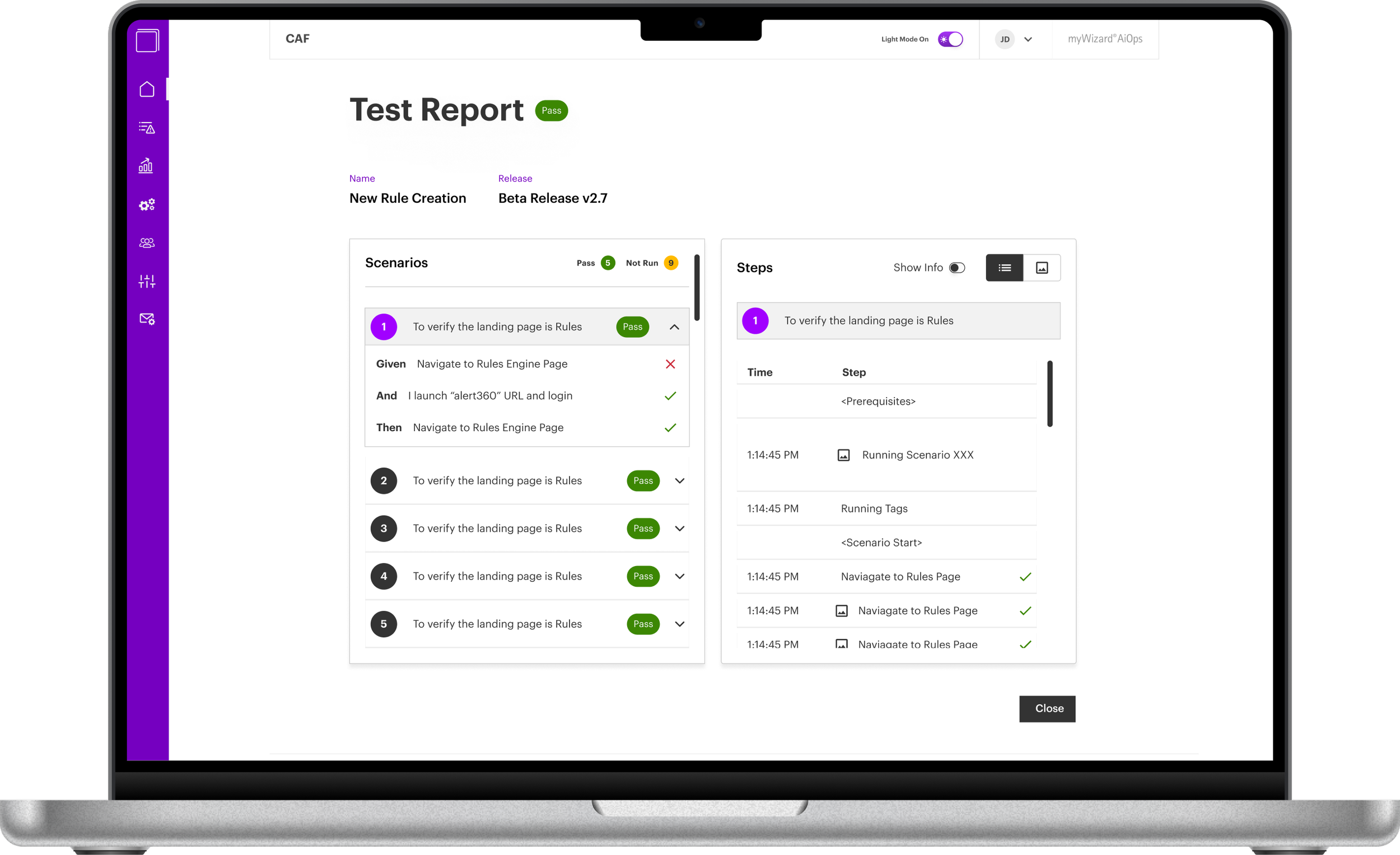
Accenture’s Codeless Automation Framework (CAF), currently only exists within a code based view. As such, it is suited only for users with technical skills and knowledge. The goal was to give the application a user interface, and refine its user experience in order to make it easy to use for different levels of technical ability. I was the sole designer on the team, and worked through a shortened design process given time restraints.
THe Design process
THe Design process
iterative design
Given I was under time constraints and was the only designer on this project, I opted for a condensed design process for the MVP. Ideally I would have included user testing and more time for discovery, however this project had its limitations. The process was iterative and left room to refine the designs after developer walkthrough or as new requirements came up.

Requirements
Alongside a business analyst, I refined and laid out the information architecture of the program. This allowed us to see which features would need to be built first, and allowed us to visualise the relationship between each.
We decided to work through each feature individually, usually within one sprint. We prioritised features by need and difficulty, and set a timeline for completion.
User flow
When beginning work on a new feature, I worked with the BA to flesh out a user flow. Each feature needed its own flow and many features required further breakdown given their complexity. This allows me to keep track of all touch points within a use case and ensure that nothing is missed. It was also useful to provide context when presenting to stakeholders.
mid-fidelity screens
When designing a new feature, I would then sketch potential ideas, then build mid-fidelity screens in Figma. I found mid fidelity screens to be the most effective when communicating designs to developers and other stakeholders, rather than just using shapes. Once interaction and layout choices had been decided on, I could move on to high-fidelity.
High-fidelity designs
I worked on the high fidelity screens alongside the myWizard design system, which aimed to unify design across the company’s products. Given that this product is designed for non-technical users, I aimed to provide an interface that was clean, easy to use and not overwhelming. This proved to be a challenge for some features given their complexity.


